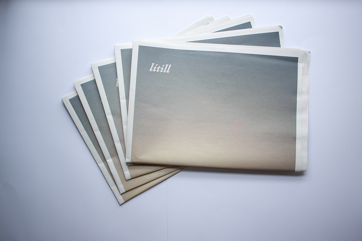
litill
Answering the brief of creating a publication either being a book or magazine or any other similar medium of publication about the topic of a recent event or trip. With a project length of 3 weeks, I chose to create a newspaper about a then recent a trip to Iceland.
Titled litill, meaning small in in Icelandic, this newspaper was my first attempt at a full editorial design, taking into account multiple factors including; paper stock, type choice, grid design and layout, hierarchy, and size as well as body copy, both original and found.
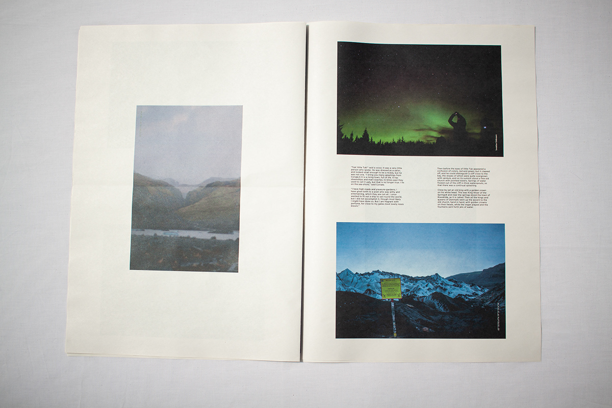
Emerging myself within Icelandic culture and folk tales, the theme within this project was small, as this reflected my experience and feelings within Iceland, while also feeling alone in such a vast landscape. This was then further represented in the designs by pushing text and copy to the corners of pages, and utilising typography in a way where legibility was intentionally tested with small type sizes and location of body copy. And the copy being a Hans Christian Erikson tale about a small Icelandic boy overcoming struggles.
This project was selected to be included as part of an end of year exhibition.